Redesign of a birth coach app by adding a symptom tracker and updating the typography, color scheme, and component styles, improving the rating by 22%.
Year
2023
ROLE
UX/UI Design
About the project
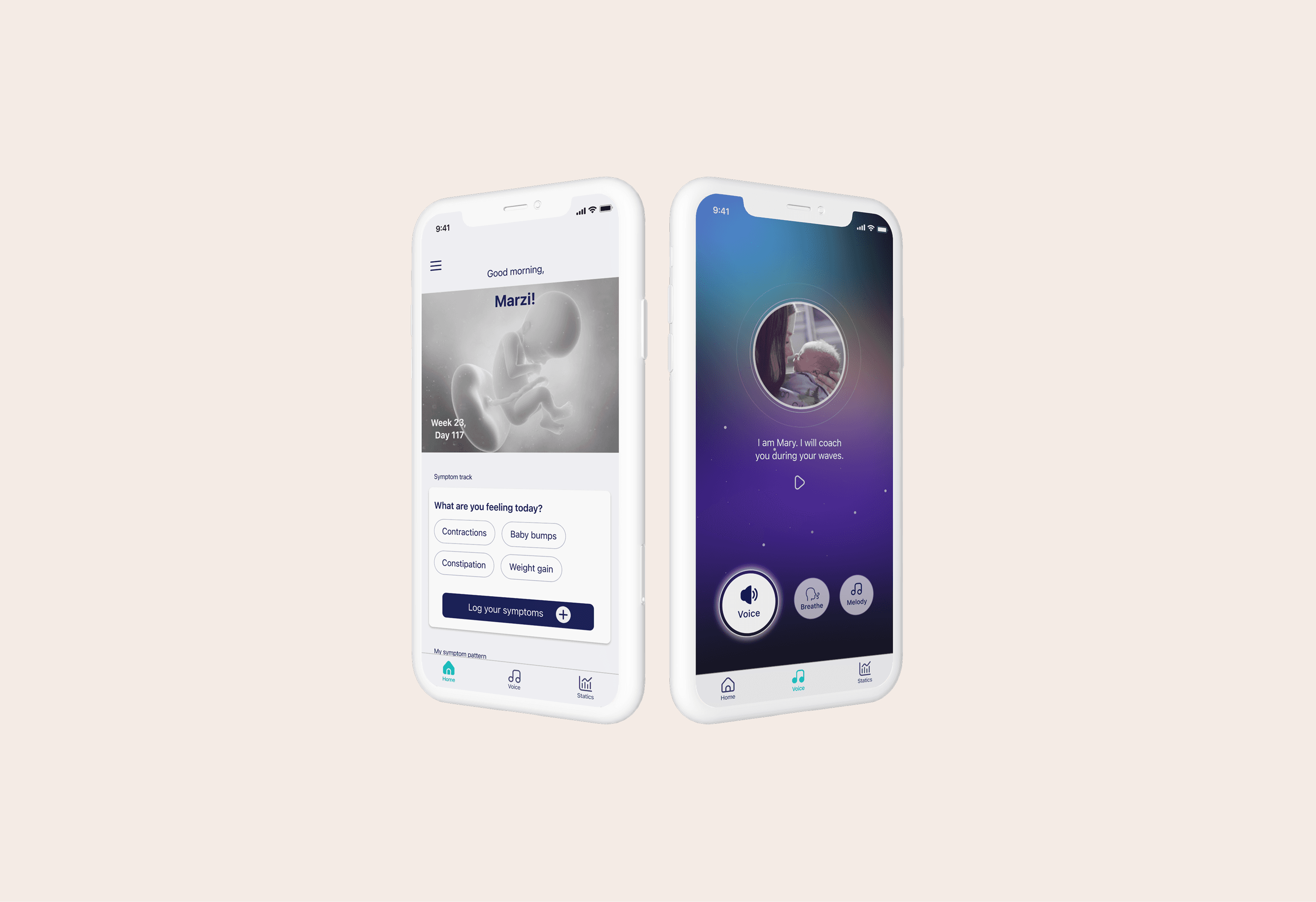
Doula is a pregnancy app that provides audio guidance in the final phase of pregnancy for managing pain during contractions.
To help expectant mothers log their symptoms and monitor changes throughout their pregnancy, the client wanted to add a symptom tracker.
The new design improves user experience and engagement by restructuring the layout and offering a tracking feature.
How did I start?
Considering the limited timeframe, I prioritized research methods that were both efficient and impactful in informing the design phase. My approach combined desk research, competitive analysis, and targeted user insights to quickly gain the necessary context.
To familiarize myself with Doula's existing environment and identify usability issues, I conducted a heuristic evaluation.
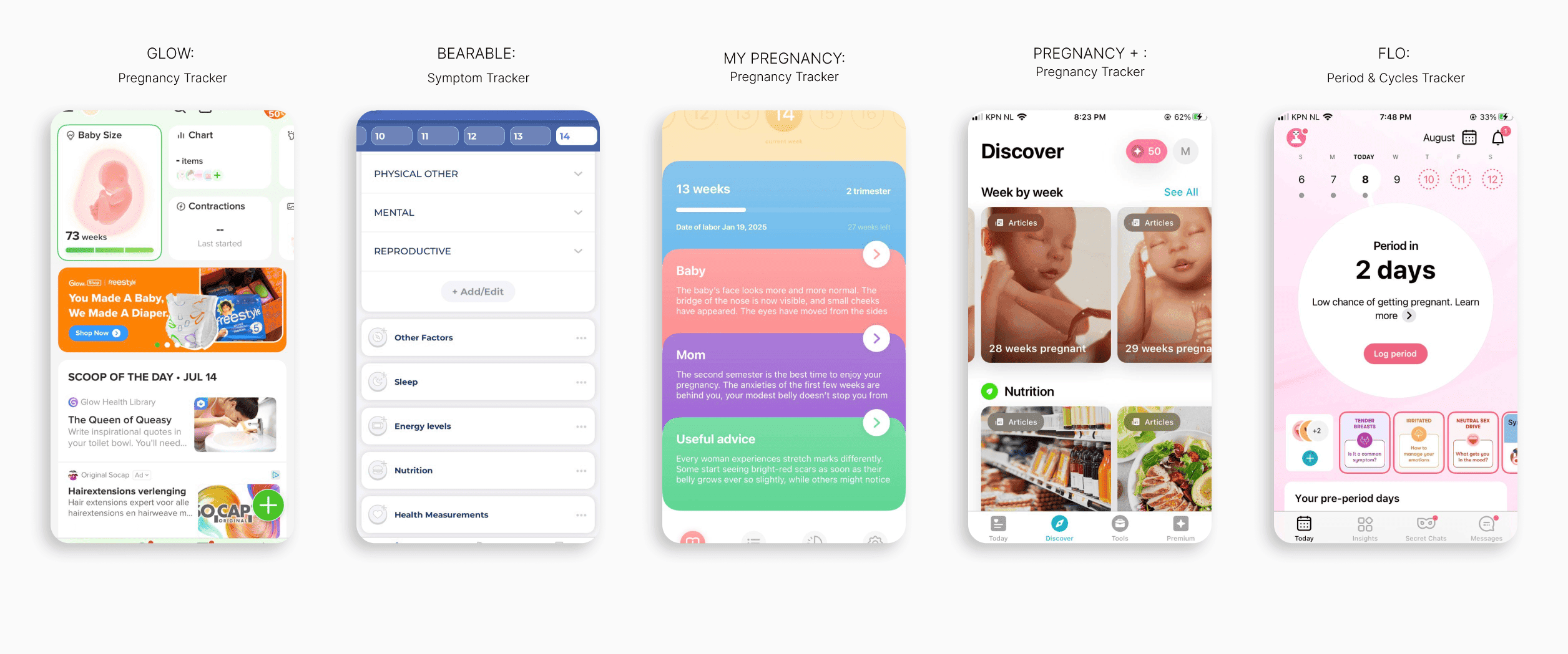
For the competitive analysis, I examined both direct and indirect competitors to understand how similar products address user needs:
Market research: Identified top-rated pregnancy tracking apps (e.g., Pregnancy +, My Pregnancy, Ovia, Glow) and symptom-tracking apps (e.g., Flo, Bearable), installing and testing their core features.
Feature benchmarking: Documented strengths and weaknesses, capturing screenshots of design patterns that could inform my solution.
User sentiment analysis: Analyzed user reviews (both highly rated and critical) to uncover common pain points and opportunities for improvement.
This approach allowed me to gain actionable insights efficiently and shaped a more informed and user-centric design direction.
Using a guerrilla research approach, I interviewed 6 women who had given birth in the past few months. I asked them to explore Doula's features, share their experiences, and highlight what they found useful and what was missing. Here are the key findings:
Single-Purpose Limitation: Users wish the app offered more than just contraction support, such as pregnancy insights or relaxation features.
Limited Differentiation: Users don’t see much distinction between the app’s features.
Users prefer contraction tracking as a separate category.

Sketches & UI
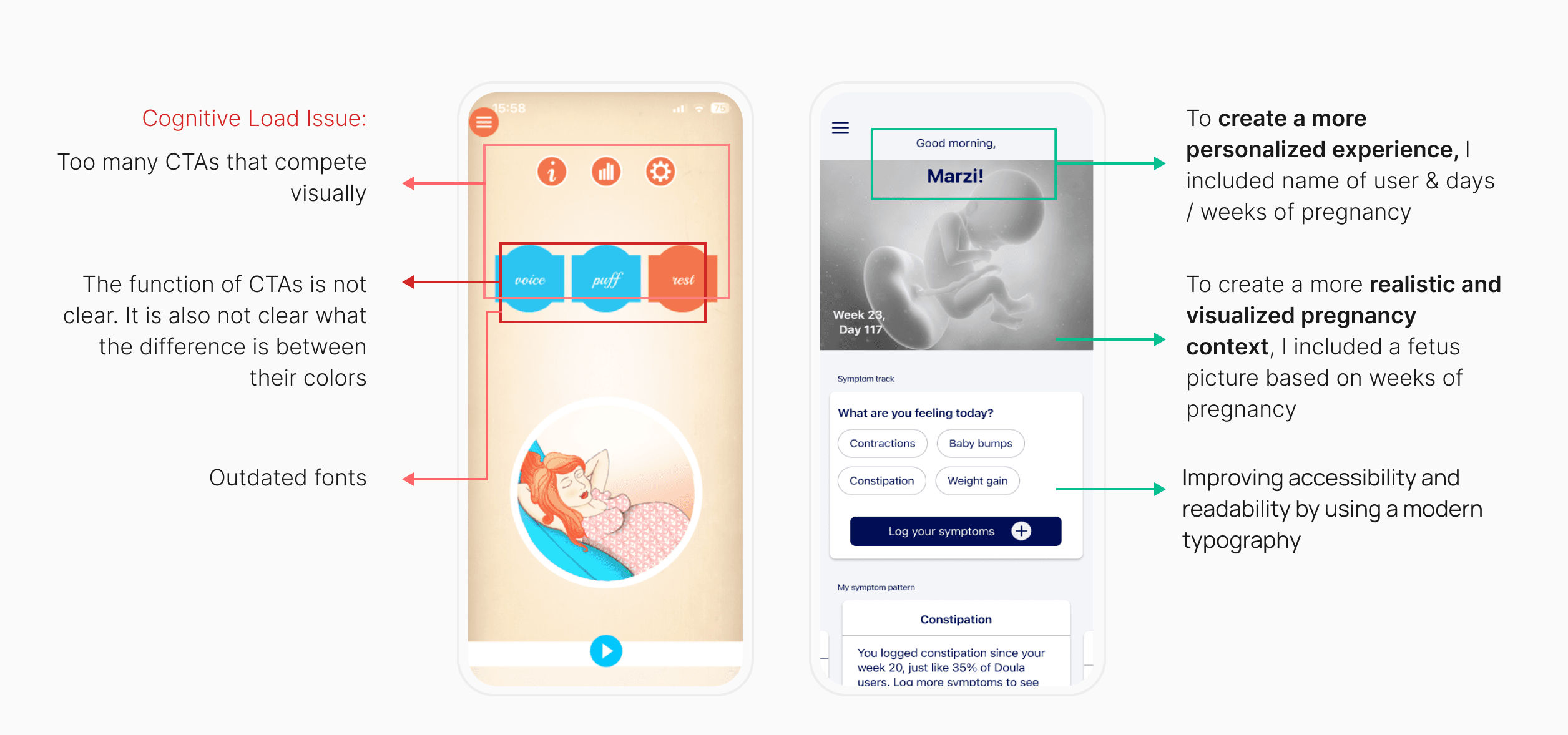
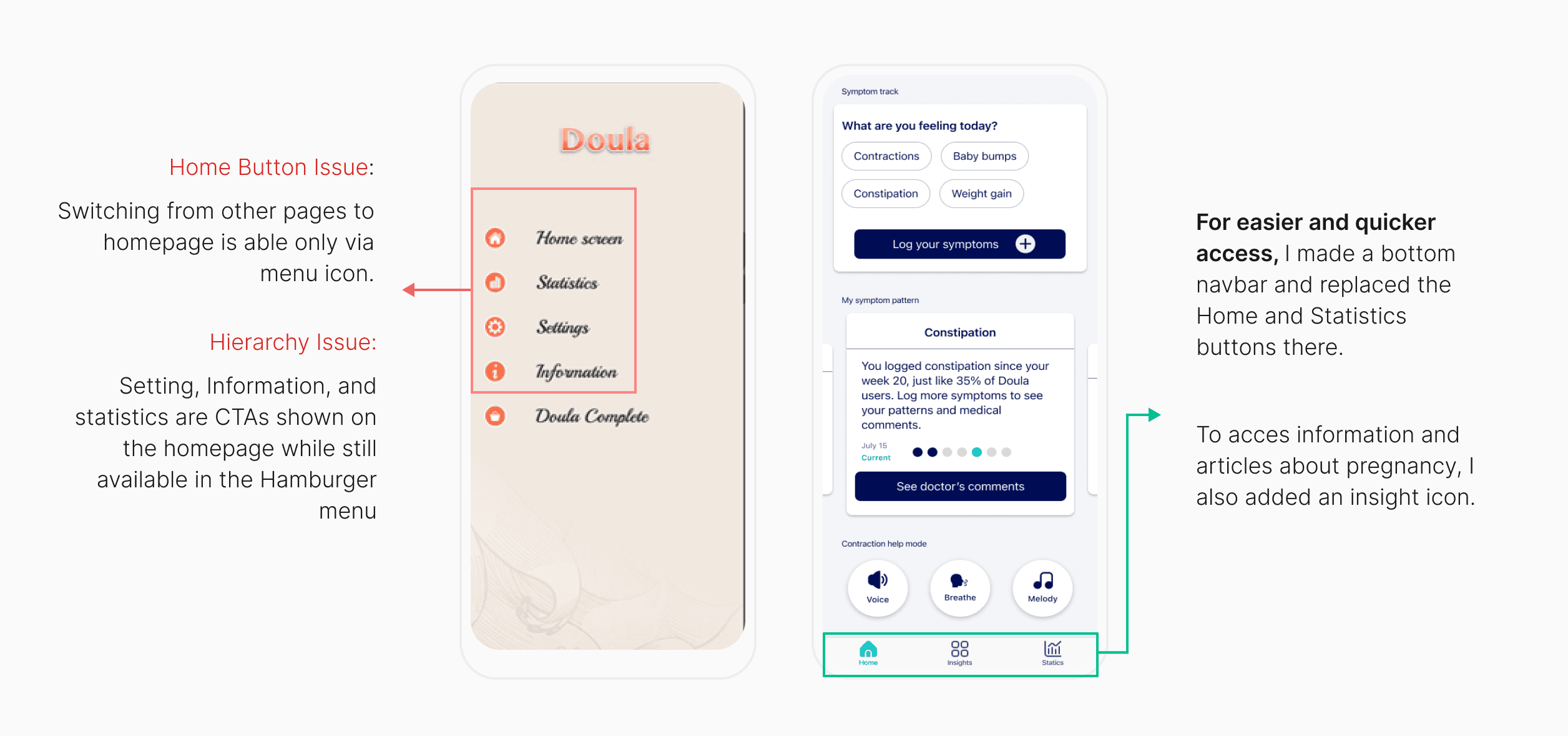
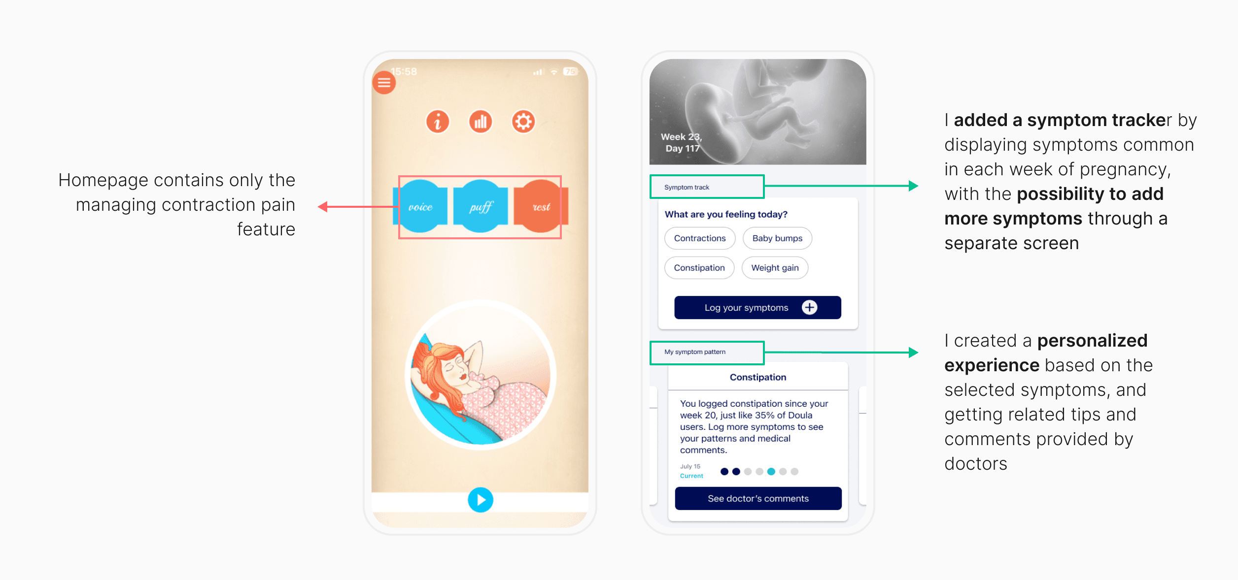
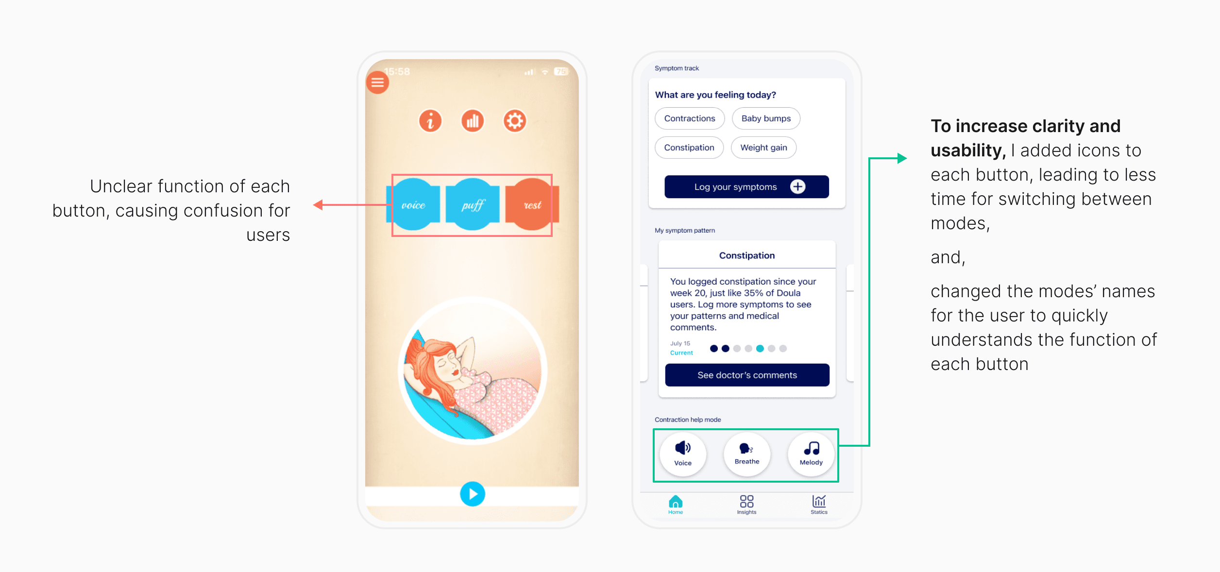
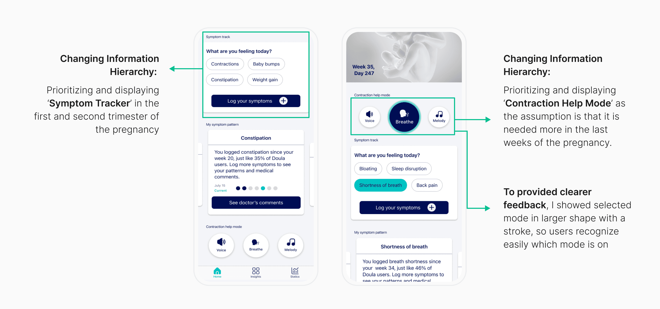
Based on all the information I gathered, I redesigned the app by adding a tracking symptom feature and improving its existing features.
The goal was to create a visual identity to help the pregnant user during contractions. Here are the improvements I made:
How did the users interact with it?
I shared the first layout with my 6 users and asked them to share their opinions and rate my design regarding the visuals and content.
50% of users found the homepage heavily loaded with information.
33% of users liked it better if they could have used the ‘Contraction Help Mode’ and ‘Symptom Tracker’ simultaneously.
65% of users suggested that ‘Contraction Help Mode’ not be in the same place as ‘Symptom Tracker’.
They scored the redesigned layout 3.6 out of 5.
Fresh paint
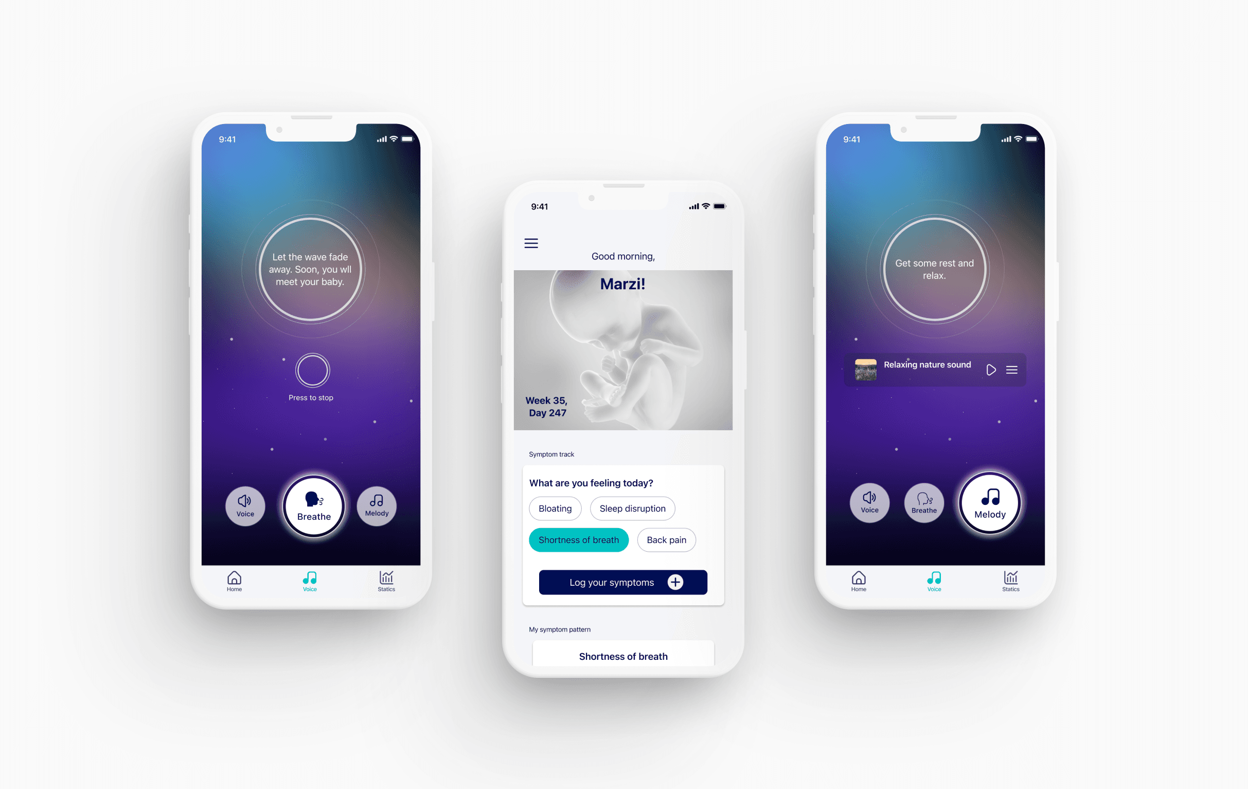
Based on the feedback I received on my first usability test, I designed a separate page for the 'contraction help mode' and added it to the tab bar as a separate section.
I also removed the 'insight' feature as it was not backed by research.
I ran a second round of user test with 6 new users to see how they liked the new layout.
The improved layout scored 4.4 out of 5.
Results
The new design positively affected user engagement, leading to an increase in the session duration by 37%, and in user satisfaction by 16%.
Learning
This project was a self-challenge where I wanted to push my UI skills while maintaining a strong UX foundation. I focused on rapid iteration and decision-making within a short timeframe, refining both my visual design and problem-solving abilities.
Through this process, I learned how strategic color choices and a streamlined interface can significantly improve user engagement. This project reinforced the importance of balancing aesthetics with functionality to create an effective user experience.
This will hide itself!
Redesign of a birth coach app by adding a symptom tracker and updating the typography, color scheme, and component styles, improving the rating by 22%.

Year
2023
ROLE
UX/UI Design
About the project
Doula is a pregnancy app that provides audio guidance in the final phase of pregnancy for managing pain during contractions.
To help expectant mothers log their symptoms and monitor changes throughout their pregnancy, the client wanted to add a symptom tracker.
The new design improves user experience and engagement by restructuring the layout and offering a tracking feature.
How did I start?
Considering the limited timeframe, I prioritized research methods that were both efficient and impactful in informing the design phase. My approach combined desk research, competitive analysis, and targeted user insights to quickly gain the necessary context.
To familiarize myself with Doula's existing environment and identify usability issues, I conducted a heuristic evaluation.
For the competitive analysis, I examined both direct and indirect competitors to understand how similar products address user needs:
Market research: Identified top-rated pregnancy tracking apps (e.g., Pregnancy +, My Pregnancy, Ovia, Glow) and symptom-tracking apps (e.g., Flo, Bearable), installing and testing their core features.
Feature benchmarking: Documented strengths and weaknesses, capturing screenshots of design patterns that could inform my solution.
User sentiment analysis: Analyzed user reviews (both highly rated and critical) to uncover common pain points and opportunities for improvement.
This approach allowed me to gain actionable insights efficiently and shaped a more informed and user-centric design direction.

Using a guerrilla research approach, I interviewed 6 women who had given birth in the past few months. I asked them to explore Doula's features, share their experiences, and highlight what they found useful and what was missing. Here are the key findings:
Single-Purpose Limitation: Users wish the app offered more than just contraction support, such as pregnancy insights or relaxation features.
Limited Differentiation: Users don’t see much distinction between the app’s features.
Users prefer contraction tracking as a separate category.

Sketches & UI
Based on all the information I gathered, I redesigned the app by adding a tracking symptom feature and improving its existing features.
The goal was to create a visual identity to help the pregnant user during contractions. Here are the improvements I made:


How did the users interact with it?
I shared the first layout with my 6 users and asked them to share their opinions and rate my design regarding the visuals and content.
50% of users found the homepage heavily loaded with information.
33% of users liked it better if they could have used the ‘Contraction Help Mode’ and ‘Symptom Tracker’ simultaneously.
65% of users suggested that ‘Contraction Help Mode’ not be in the same place as ‘Symptom Tracker’.
They scored the redesigned layout 3.6 out of 5.
Fresh paint
Based on the feedback I received on my first usability test, I designed a separate page for the 'contraction help mode' and added it to the tab bar as a separate section.
I also removed the 'insight' feature as it was not backed by research.
I ran a second round of user test with 6 new users to see how they liked the new layout.
The improved layout scored 4.4 out of 5.

Results
The new design positively affected user engagement, leading to an increase in the session duration by 37%, and in user satisfaction by 16%.
Learning
This project was a self-challenge where I wanted to push my UI skills while maintaining a strong UX foundation. I focused on rapid iteration and decision-making within a short timeframe, refining both my visual design and problem-solving abilities.
Through this process, I learned how strategic color choices and a streamlined interface can significantly improve user engagement. This project reinforced the importance of balancing aesthetics with functionality to create an effective user experience.
This will hide itself!
Redesign of a birth coach app by adding a symptom tracker and updating the typography, color scheme, and component styles, improving the rating by 22%.

Year
2023
ROLE
UX/UI Design
About the project
Doula is a pregnancy app that provides audio guidance in the final phase of pregnancy for managing pain during contractions.
To help expectant mothers log their symptoms and monitor changes throughout their pregnancy, the client wanted to add a symptom tracker.
The new design improves user experience and engagement by restructuring the layout and offering a tracking feature.
How did I start?
Considering the limited timeframe, I prioritized research methods that were both efficient and impactful in informing the design phase. My approach combined desk research, competitive analysis, and targeted user insights to quickly gain the necessary context.
To familiarize myself with Doula's existing environment and identify usability issues, I conducted a heuristic evaluation.
For the competitive analysis, I examined both direct and indirect competitors to understand how similar products address user needs:
Market research: Identified top-rated pregnancy tracking apps (e.g., Pregnancy +, My Pregnancy, Ovia, Glow) and symptom-tracking apps (e.g., Flo, Bearable), installing and testing their core features.
Feature benchmarking: Documented strengths and weaknesses, capturing screenshots of design patterns that could inform my solution.
User sentiment analysis: Analyzed user reviews (both highly rated and critical) to uncover common pain points and opportunities for improvement.
This approach allowed me to gain actionable insights efficiently and shaped a more informed and user-centric design direction.

Using a guerrilla research approach, I interviewed 6 women who had given birth in the past few months. I asked them to explore Doula's features, share their experiences, and highlight what they found useful and what was missing. Here are the key findings:
Single-Purpose Limitation: Users wish the app offered more than just contraction support, such as pregnancy insights or relaxation features.
Limited Differentiation: Users don’t see much distinction between the app’s features.
Users prefer contraction tracking as a separate category.

Sketches & UI
Based on all the information I gathered, I redesigned the app by adding a tracking symptom feature and improving its existing features.
The goal was to create a visual identity to help the pregnant user during contractions. Here are the improvements I made:


How did the users interact with it?
I shared the first layout with my 6 users and asked them to share their opinions and rate my design regarding the visuals and content.
50% of users found the homepage heavily loaded with information.
33% of users liked it better if they could have used the ‘Contraction Help Mode’ and ‘Symptom Tracker’ simultaneously.
65% of users suggested that ‘Contraction Help Mode’ not be in the same place as ‘Symptom Tracker’.
They scored the redesigned layout 3.6 out of 5.
Fresh paint
Based on the feedback I received on my first usability test, I designed a separate page for the 'contraction help mode' and added it to the tab bar as a separate section.
I also removed the 'insight' feature as it was not backed by research.
I ran a second round of user test with 6 new users to see how they liked the new layout.
The improved layout scored 4.4 out of 5.

Results
The new design positively affected user engagement, leading to an increase in the session duration by 37%, and in user satisfaction by 16%.
Learning
This project was a self-challenge where I wanted to push my UI skills while maintaining a strong UX foundation. I focused on rapid iteration and decision-making within a short timeframe, refining both my visual design and problem-solving abilities.
Through this process, I learned how strategic color choices and a streamlined interface can significantly improve user engagement. This project reinforced the importance of balancing aesthetics with functionality to create an effective user experience.
This will hide itself!